Appearance
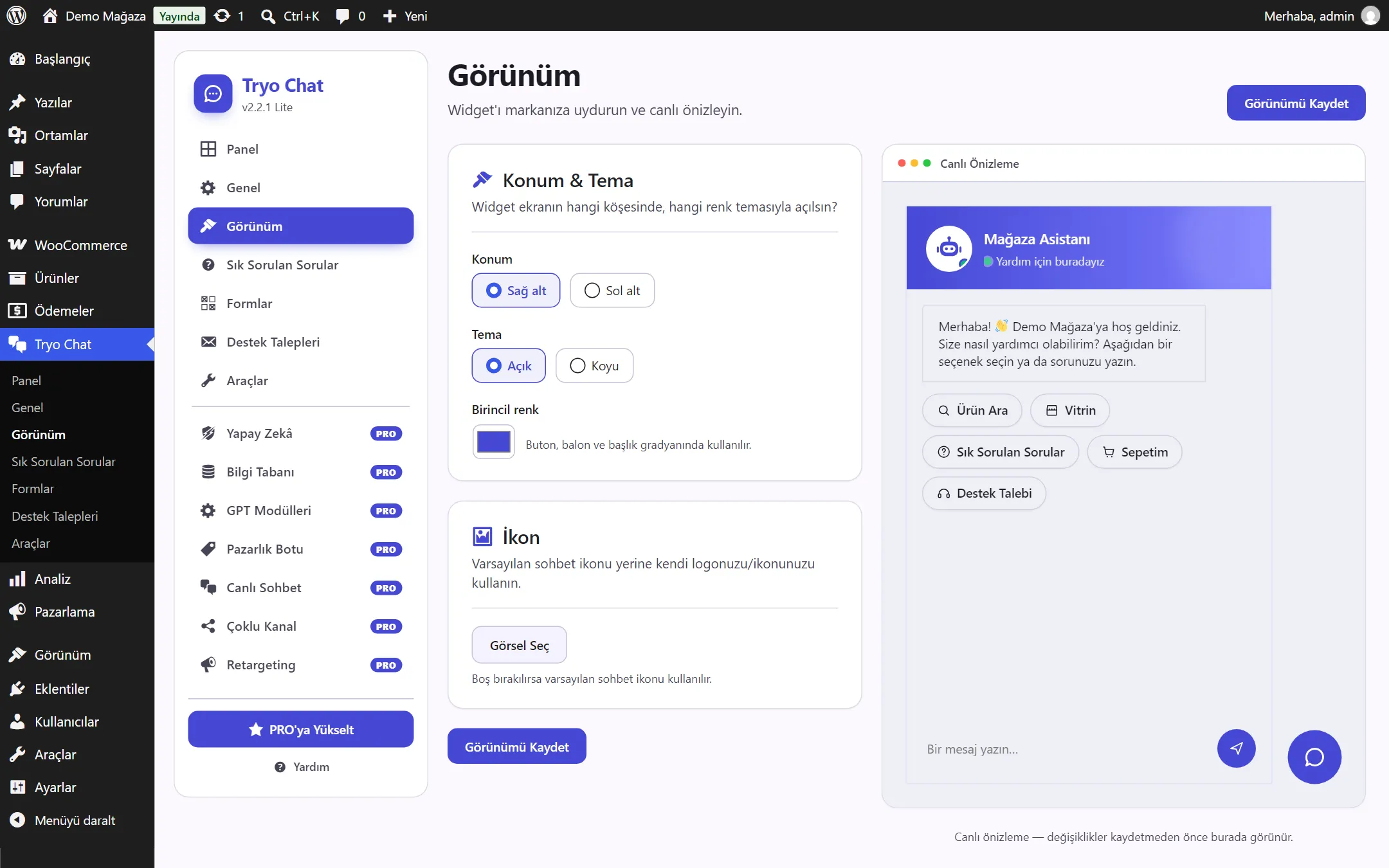
On the Tryo Chat → Appearance page you match the widget to your brand. The Live Preview on the right shows changes before you save them.
Position and theme
Section titled “Position and theme”- Position: Bottom right or Bottom left. If your site has another button at the bottom right (for example a “back to top” button), choose bottom left.
- Theme: Light or Dark. In the dark theme, a lighter shade of your primary color is used automatically for text so that it stays readable.
Primary color
Section titled “Primary color”The chat button, header, visitor message bubbles and buttons are colored with this. Choose your brand color from the color picker.
Use Select Image to pick your own logo or icon from the Media Library. The icon appears on the chat button. A square image of at least 64×64 pixels works best. If you leave it empty, the default chat icon is used.
After making changes, click Save Appearance.
Examples
Section titled “Examples”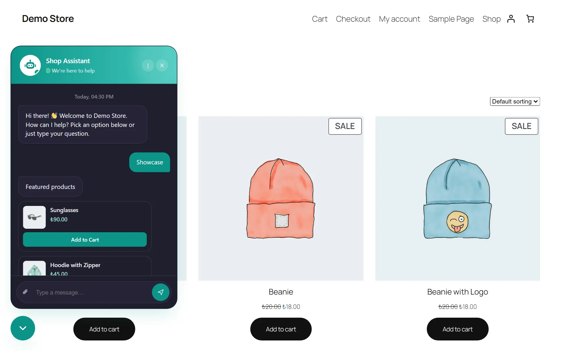
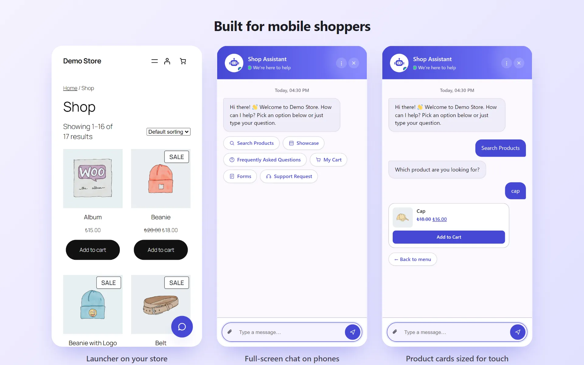
On phones the chat opens full screen: